This is a magazine spread featuring a Michael Bieraut article explaining how the typeface Baskerville is subconsciously associated with the truth.
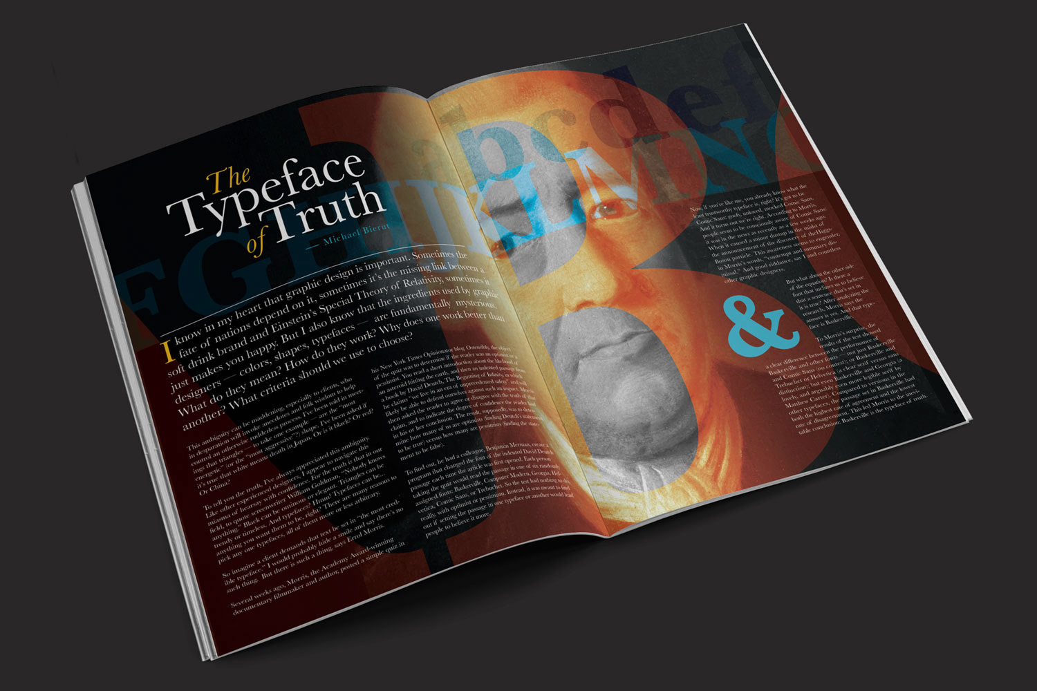
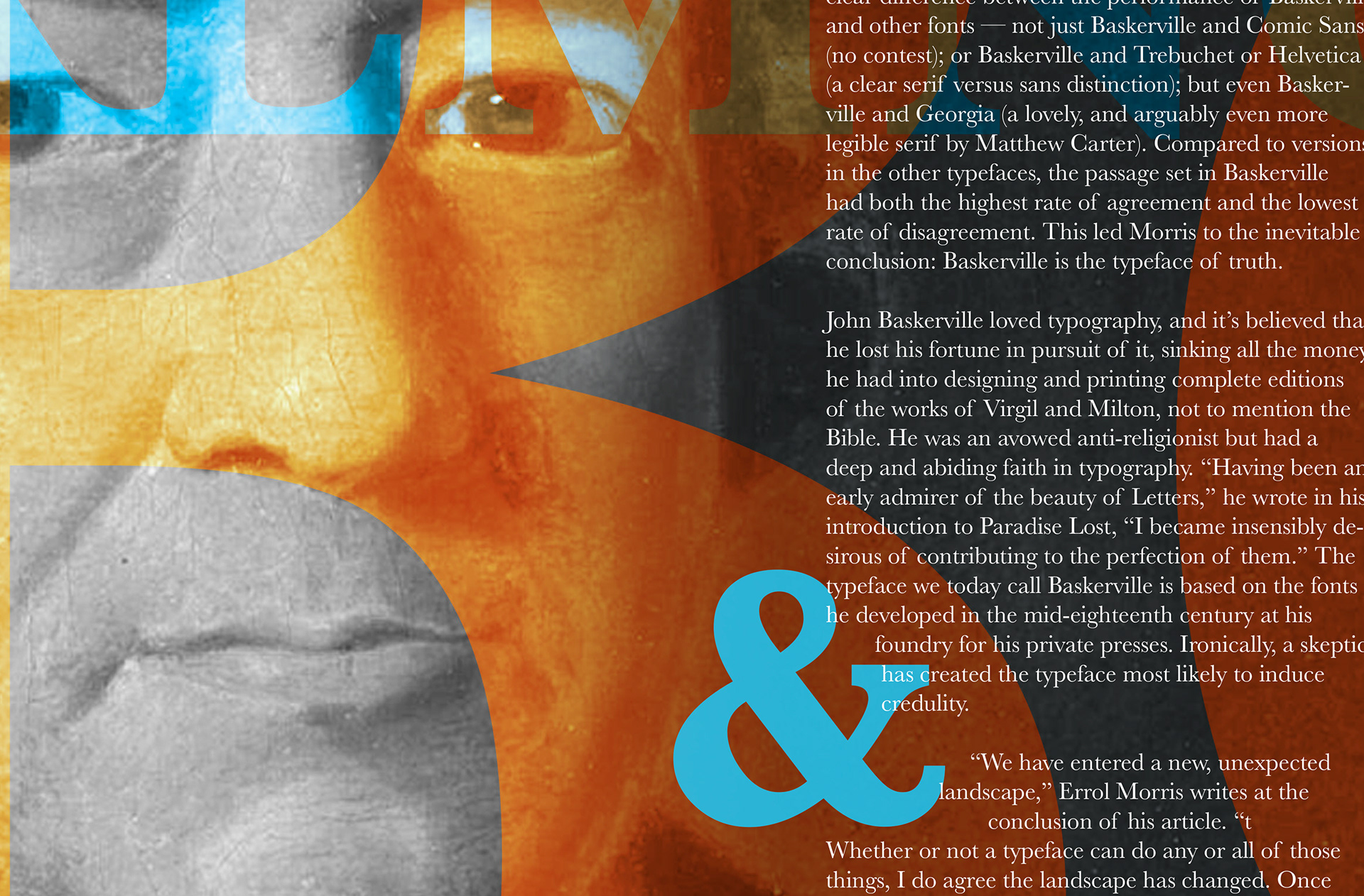
For the main image of this composition, I chose to have an old photo of John Baskerville framed with letters of his legendary type face in alphabetical order. I also made sure the "B" of Baskerville was front and center for visual impact.
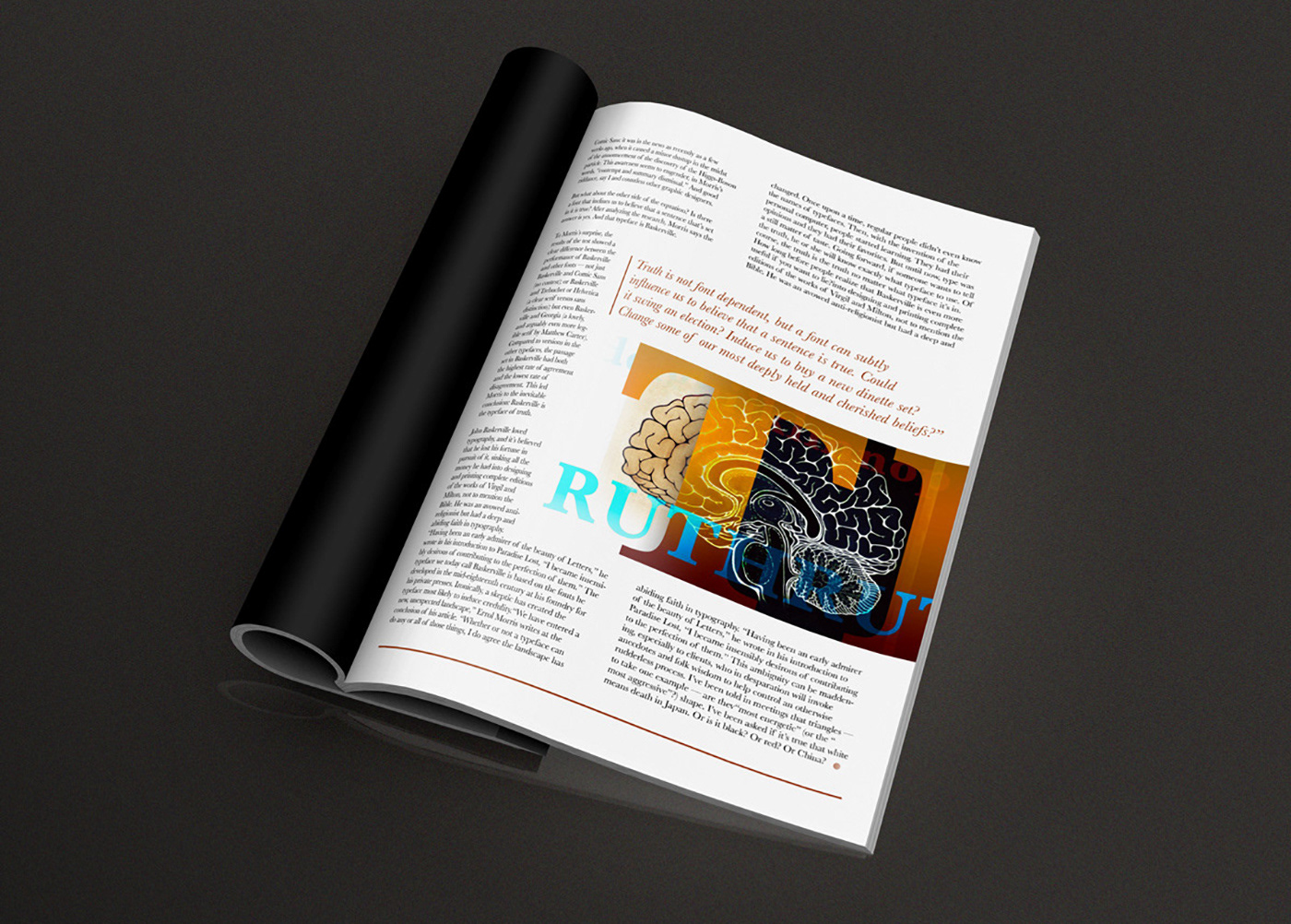
On the secondary image, I used a scientific illustration of a human brain with the same overlapping and color but instead of just showing the alphebet, I decided to use the word truth repeated and overlayed to help tie the visual with the articles premise.